


We’ve written extensively about how in terms of modern day marketing, data visualization needs to become a cornerstone of your efforts and it needs to do so right away. Statistics and other forms of raw data can be incredibly powerful, but not if you allow them to stand alone.
Remember that it’s less about the numbers and more about the story those numbers are trying to tell. To that end, you need data visualization to take these ideas and make them compelling to your target audience. Data visualization adds credibility to your argument, increases both the impact and recall of your messaging and can even act as a powerful new opportunity for engagement with your audience.
Having said that, it’s equally important that you understand data visualization itself is a tool — just like any other. It’s very possible to misuse or misunderstand a tool or to employ it in such a way (read: the wrong way) to where you move farther away from your goal, not closer to it.
As with other efforts you’ll make in your small business marketing, it is just as essential that you know what not to do in terms of data visualization as you know what to do.
The don’ts of data visualization
Perhaps the biggest mistake that you can make in terms of data visualization is to let your content get too unwieldy. Remember that part of why data visualization is so effective in the first place is because it takes inherently dry data and repackages it in a form that is fresh, new and interesting.
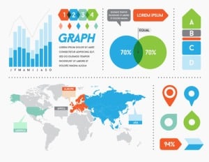
You can take all of those benefits and ruin them in a way that’s difficult to fix if you forget that content like Infographics are supposed to be simple in the first place.
There’s a reason why the most successful infographics are not just pages and pages of stats with pretty pictures next to them. Content like an infographic needs to be focused – every statistic or piece of data you choose to include must be in support of a larger idea.
Think about the underlying narrative that you’re trying to highlight as the spine of the story you’re telling. Anything that moves too far away from the spine needs to go.
You may think it’s interesting that you’ve always wanted to run your own business since you were a child and that you won a competition when you were in high school, but how does that really support the narrative of your product or service as it exists today?
How does that information help drive home the point that your product or service is going to make your customer’s life better?
The answer is simple: it doesn’t. So rather than let your visual content get too bogged down and overwhelming, which is exactly what you were trying to avoid in the first place, you need to jettison those elements as soon as you can.
“Short” and “sweet” are the terms you need to be focused on. It IS possible to make a boring Infographic. It’s actually incredibly easy to do so if you don’t practice self control.
Data visualization best practices
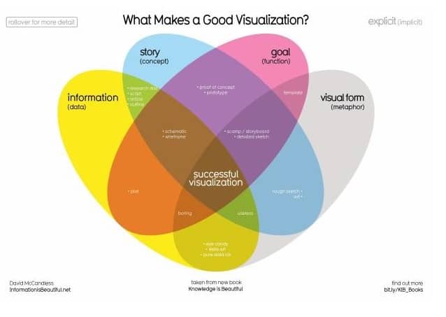
Again: the decisions you’re making in terms of data visualization need to be in support of a larger narrative or compelling idea.
To put it another way, don’t use tools like infographics because a study showed you that they’re more likely to get shared on social media. Use an infographic because it’s the best way to get across the point you’re trying to make in the first place.
If there’s a particular story that you’re trying to tell – like if you’re trying to pull back the curtain and let people in on the research and development process of your product or service – use data visualization because you have to and not because you think you need to.
Play it through in your head. You could write a 1,000 word blog post about all the decisions you made, the money you spent, the mistakes you had to work around, etc. Or you could use infographic resources to take all of that same data and present it in a much more simplistic, visual way.
You’ve thought out both techniques and have determined that data visualization is the right way to get across the right message to the right people at the right time. Only then should you pull the trigger and actually craft the type of content you need to support that message.
There truly is no “silver bullet” when it comes to marketing – only a series of tools used in support of your goals. Depending on the goal (and the audience you need to activate in order to reach it), data visualization may not necessarily be the best way at all times. But when it is, it can help you craft something powerful.
In many ways, the single most important data visualization “best practice” is the acknowledgement that it is only a means to an end, the same as anything else. It is not the end in and of itself.
The power of data visualization
Data visualization is a powerful weapon in terms of crafting compelling, modern day marketing campaigns – or at least, it can be. It’s very possible to use a weapon incorrectly and if you do, the damage you inflict will be directed inward.
By understanding more about why data visualization is so compelling and taking the time to learn about its strengths and weaknesses, you’ll put yourself in the best possible position to use it properly.
Never forget the simple fact that data visualization is not designed to replace the true message at the heart of your marketing. The numbers you’re visualizing are not the story you’re telling, regardless of how pretty or visually interesting they may be.
Data visualization is used to strengthen and support that underlying message. If you’re able to keep your eye on this one simple prize, rest assured – you will go far.