


In July 2016, I attended a great talk by Gregor Hohpe (Chief IT Architect at Allianz) at Microservices Meetup Munich. He used a great exercise to demonstrate that human beings often make bad, irrational decisions. I want to use this example to explain why everybody (especially business executives, managers, developers and data scientists) should leverage visual analytics to make data-driven decisions instead of listening to gut feeling.
Taking a death pill
 Here is the pills exercise, which Gregor Hohpe discusses in his book, “37 Things One Architect Knows”:
“A jar contains 1,000,000 pills. One pill is (painlessly) deadly. How much money for you to take one?”
The possible answers are receiving money ranging from $10 to $1 million, or not taking a pill. From around 100 people in the room, one person chose to take a pill for $100, and around 20 or 30 people raised their hand for $1 million. The other 70 percent chose a “get out of here” option–they still stayed in the room, but decided not taking a pill.
I also thought about “getting out of here,” or maybe taking the try for $1 million. The one guy raising his hand and taking the risk for $100 already knew Gregor’s answer (which I quote from his book):
“Most people will answer something like $1,000,000 dollars or straight-out refuse. However, the same people are quite willing to cross the road on a red light (with their eyes open) or go snowboarding for a day, each of which carries the risk of swallowing a couple of pills. It would be difficult to make the case that the 30 seconds you saved by crossing the road would have earned you the equivalent of a million dollars.”
Death pills and data-driven decisions
I think the key lesson learned from Gregor’s exercise is that we should not trust our gut feeling all the time when making important decisions, no matter if you are an executive or “just” a knowledge worker. Today, we store all kinds of data (from sensors, social feeds, and many other data sources) into a data warehouse or big data store such as Apache Hadoop. The data is ready to be analyzed.
Let’s use this data to make better data-driven decisions instead of relying on gut feeling. You need not be a data scientist or expert in mathematics, statistics or machine learning. Making better data-driven decisions is important for executives, business users, and developers, for example. But how can you do that?
 Visual analytics tools

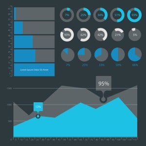
Human beings have problems analyzing big masses of data and finding complex relationships between different data sets. But as a picture is worth a thousand words, everybody can avoid making decisions based on gut feeling by using tools for visual analytics. They are very easy to use and allow visualizing and analyzing complex relationships in data to find new insights interactively. This is often also called “data discovery.”
In addition, machine learning and advanced analytics are getting more and more important due to big masses of data and trends such as mobile, cloud and Internet of Things. Digital transformation is disrupting almost any industry these days. Therefore, many real-world use cases leverage the knowledge of subject matter experts (i.e. business users or analysts) in combination with data scientists who take care of building analytic models. Both work together with the same visual analytics tools to make the best decisions and to reach the best results by leveraging visualization and predictive models.
A good visual analytics tool includes the following characteristics and features:
- Ease-of use and an intuitive user interface for business users to create interactive visualizations
- Various visualization components such as bar charts, pie charts, histogram, scatter plots, treemaps, trellis charts, and many more
- Connectivity to various data sources (e.g. Oracle, NoSQL, Hadoop, SAP Hana, Cloud Services)
- True ad-hoc data discovery: real interactive analysis via drag-and-drop interactions (e.g. restructure tables or link different data sets) instead of “just” visualizing data sets by drill-down / roll-up in tables.
- Support for data loading and analysis with alternative approaches: in-memory (e.g. RDBMS, spreadsheets), in-database (e.g. Hadoop) or on-demand (e.g. event data streams)
- In-line and ad-hoc data wrangling functionality to put data into the shape and quality that is needed for further analysis
- Geoanalytics using geo-location features to enable location-based analysis beyond simple layer map visualizations (e.g. spatial search, location-based clustering, distance and route calculation)
- Out-of-the-box functionality for “simple” analytics without coding (e.g. forecasting, clustering, classification)
- Out-of-the-box capabilities to realize advanced analytics use cases without additional tools (e.g. an embedded R engine and corresponding tooling)
- Support for integrating any additional advanced analytics and machine learning frameworks (such as R, Python, Apache Spark, H20.ai, KNIME, SAS or MATLAB)
- Extendibility and enhancement with custom components and features
- Collaboration between business users, analysts and data scientists within the same tool without additional third-party tools (e.g. ability to work together in a team, share analysis with others, add comments and discussions)
Take a look at available visual analytics tools on the market with the above list in mind and select the right one for your use cases. Three of the most well known options are Tableau, Qlik and TIBCO Spotfire. While the first two are more widespread up to now, the latter in contrary is more powerful and allows true ad-hoc data discovery as well as advanced analytics use cases without any additional tooling.
Streaming analytics to put insights into action in real time
The next step after finding insights in historical data is the move from predictive analytics (which answers “what will happen?”) to prescriptive analytics (which answers “what should be done?”).
What does this mean? After finding valuable insights by building an analytics model from historical data, a developer can reuse this analytic model and put it in action into an event processing engine – usually without redeveloping the analytic model. This real-time processing can be implemented either using an open-source framework such as Apache Storm, Apache Flink, Apache Spark Streaming, Apache Apex, or Concord, or a powerful product such as IBM InfoSphere Streams, Software AG Apama or TIBCO StreamBase. The latter, TIBCO StreamBase, works very well together with TIBCO Spotfire including out-of-the-box connectivity and commercial support for both together.
Data-driven decision making with visual analytics
This post discussed why everybody should focus on making better decisions by leveraging visual analytic tools. Thinking back to the death pill exercise, in the same way it is key for success to let data guide a decision when you need to, for example, determine if a transaction is fraudulent or not, whether to replace a machine before it breaks or not, or if you should give a specific discount to a customer before he leaves the store or not.
True ad-hoc data discovery using visual analytics and advanced analytics in combination with real-time event processing allows putting the analytic models into action to get the real value out of the insights in future events. For more details including the full lifecycle of such as project, how to put these insights into action afterwards, and several real world use cases, take a look at this article: “How to Apply Machine Learning to Event Processing.”